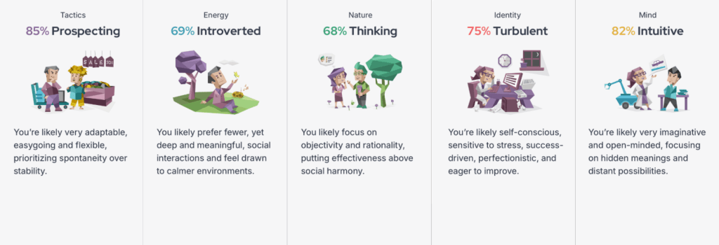
Strengths:
My ability to look beyond traditional frameworks helps me solve otherwise perplexing scenarios in unexpected ways.
I swiftly recognize hidden connections between ideas, enabling me to identify solutions that others may miss.
My genuine eagerness to learn ensures continuous growth, leading me to regularly expand my skill set.
I adjust comfortably to new information or changing circumstances, maintaining clarity even when others feel overwhelmed.
My desire to work autonomously empowers me to remain focused and engaged with my tasks, without needing constant supervision.
I place great emphasis on fact-based understanding, ensuring my decisions are soundly reasoned and thoroughly researched.
Weaknesses:
My tendency to become bored with routine or repetitive steps can prevent me from fully carrying tasks through to completion.
Rigid systems, rules, or procedures can demotivate me, making traditional workplaces or tightly controlled processes particularly frustrating.
My preference for theoretical exploration can lead me to overlook essential details required to execute my plans successfully.
Self-promotion and networking can feel deeply uncomfortable to me, causing my strengths and contributions to go unnoticed.
Opportunities:
I can use my creativity to help me in future jobs or projects.
I usually adapt pretty well when things change.
I like learning new things so I can keep improving my skills.
I’m able to think of different ideas and solutions to problems.
Since I work better independently, I can stay focused on projects for long periods of time.
My imagination could help me in creative careers like design or art.
I pay attention to details which can help me produce better work.
I’m always trying to improve myself and look for a better workflow.
I can stay calm and think logically when faced with a problem.
I’m open to different ideas.
Threats:
I tend to overthink situations more than I should.
Stress can sometimes affect confidence and motivation.
I’m a perfectionist.
I sometimes wait too long to start something because I want it to be good.
I’m more introverted and have a low social battery so speaking in groups can be a task in and of itself.
I can get distracted by too many ideas at once.
I sometimes doubt myself even when I’m doing well.
I may spend too much time thinking instead of taking action..
I sometimes focus more on logic than emotions during disagreements.
Burnout can happen when I overwork myself or stress too much.
Action Plan And Targets
What are you doing this year?
Academic Study Skills
Time management
Research
Evaluations
Referencing
UX/UI
Designing website for paper jam
Relearning figma
What do you need to succeed?
Constantly improve
Do work to the best your abilities
Achieve high marks
Be passionate
Face challenges
Focus
Dont fall behind
Manage time
Role Responsibilities Expectations
Arrive on time
Attend
Do the work to the best of your abilities
Hand in on time
Work in your own time
Be respectful
Behaviours
Maturity
Patience
Vocal
Understanding
Supportive
Contribution
Respect
Non-disruptive
2026 Graphic Design Trends
Make Me A Copy
In Print
At the tail end of 2025, Xerox printers were being used for a soft layer of low-resolution grain or the surprise appearance of debris stuck to the platen glass. The average printer has become decreasingly popular and techniques like Risograph have taken over the print scene in the last decade. A raw, gritty, grunge look has made a return, giving us something raw and deliberately lo-fi in full colour. What we’re calling the warning low ink look was a defining feature of type designer Charlotte Rohde’s launch of Oficía Mono last year. It was showcased in an office-photocopier-style campaign for the typeface. Low ink coverage made the designer’s new brand mark appear as if it were shifting, dissolving (or dancing) as colour runs out. This soft, flattened effect is even seeing photographers scanning their prints back in, for the nostalgic 1980s magazine feel that seemingly everyone is aiming for at present. As current AI image generators still struggle with authentically replicating the nuances of a layered, mixed-media style, we think that an overworked, scanned or heavily textured approach to image-making will only grow in 2026.
The Visual Index
In Assets
Last year, the tendency in the display of assets named “The Library” was observed. They looked into motion design which shuffled through images for viewing like a deck of cards. Now they’re being laid out in one neat run. designers gathered their assets in cut and paste inventories of shapes and forms making collections into a visual format. It’s done similar to how ornaments are collected and kept on display. cut-outs are collaged and isolated from their context in Sunroom’s snail mail and Miguel Vides posters alike. This format has brought about this visual need to order and organise items. The inherent sense of nostalgia within this visual ordering also defined aspects of From Form’s 2025 Museum Night identity, in reference to the early 2000s collecting era. these miniature archives of objects can be colourful, nostalgic and playful, or more didactic and utilitarian, like the spreads of visual artist Hyejin Song’s book of sushi utensils where objects are laid out across spreads like a table of tools. It’s acting as a fun framing device for our visual hoarding.
Adobe Max Tutorial Analysis
https://www.adobe.com/max/2025/sessions/from-flat-to-fantastic-branding-in-3d-os101.html
- turning flat designs into 3D branding
- using Illustrator and Project Neo together
- 3D makes branding look more modern and interactive
- easier to grab attention on social media
- importing vector graphics straight into Neo
- workflow is supposed to be easier and faster
- adding depth with lighting and shadows
- textures make designs feel more realistic
- lighting changes the mood of the design a lot
- experimenting with perspective and camera angles
- 3D logos feel more immersive than flat ones
- can export for websites, motion graphics, socials etc.
- Project Neo beginner friendly for 3D
- combining 2D and 3D is becoming more common in design
- focus on making branding feel more alive
- speaker encouraged experimenting instead of staying safe
- bold shapes and textures stand out more
- 3D branding is more engaging for audiences
- Adobe pushing toward integrated creative workflows
- 3D tools are getting easier for everyday designers to use
https://www.adobe.com/max/2025/sessions/see-like-a-lettering-designer-build-better-typogra-os340.html
- typography affects how people feel about a design
- learning to see letters like a lettering designer
- every letter has structure or purpose
- small changes in letters can completely change the mood
- optical adjustments are important in typography
- letters aren’t always mathematically perfect they’re adjusted visually
- spacing between letters matters just as much as the letters themselves
- typography communicates emotion and personality
- different type styles give different messages
- showed process from sketch
- sketching first helps explore ideas faster
- balance and consistency are really important
- paying attention to curves, thickness, spacing and proportions
- typography is everywhere in branding and layouts
- logos become stronger with custom lettering
- understanding letterforms helps improve all design work
- imperfections can sometimes make typography feel more human
- type should be readable but still expressive
- designer encouraged slowing down and observing details more
- typography is both technical and creative
- lettering is more handcrafted and personal than standard fonts
- practice helps train your eye to notice details in letters
- good typography can completely change how a brand feels
https://www.adobe.com/max/2025/sessions/transform-images-into-animations-with-photoshop-an-os321.html
- turning still images into animations using Photoshop and Firefly
- creating seamless looping animations
- composite image in Photoshop first
- masking tools to cut out subject
- Firefly text to image used to add or improve visuals
- AI tools speed up the creative process
- image to video feature turns static images into motion
- prompts can control movement and animation style
- adding motion makes designs feel more alive
- use Photoshop timeline panel to edit animations
- layering different elements creates more depth in animations
- movement doesn’t need to be extreme
- looping animations are good for social media
- combining traditional Photoshop skills with AI tools
- text prompts help generate scenes and effects faster
- workflow goes back and forth between Photoshop and Firefly
- lighting makes animations look more realistic
- animations help make content more engaging for audiences
- AI is being used as a tool
- timeline editing still important for final polish
- easier for beginners to experiment with motion design now
- can use animations for branding, ads, portfolios, socials etc.
- speaker showed how simple images can become dynamic visuals
- AI tools make animation more accessible for designers
I refuse to use AI to generated slop as a final outcome to this response so I made this instead using Photoshop’s beta tools.
Article Analysis
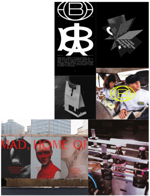
What makes a branding system sustainable? For Stoëmp, it’s rooting it in something deeper than style
Wojciech and co-founder Gaetano Licata found that a lot of branding now is too focused on trends and trying to constantly appeal to algorithms and audiences instead of actually building something with a proper identity behind it. The article mainly focuses on how their studio approaches branding differently by thinking more long term and creating systems that can last instead of temporary visuals that follow trends. The article is mostly aimed at graphic designers, branding studios and people interested in visual identity. I think it would also be useful for design students as it talks more about process and ideas behind the work instead of only showing final outcomes.
One thing the article kept coming back to was research. Stoëmp explained that they spend a lot of time trying to understand why a brand exists, what it is trying to communicate and how it should present itself before they even start designing. Thomas De Vylder explained that they try to create a structure that guides everything else afterwards such as naming, tone of voice and the visual identity itself. The article made it pretty clear that they care more about clarity and purpose than just making something look visually impressive.
I also found it interesting that the studio didn’t want to create a certain aesthetic like a temporary feel that would become dull in a few years down the road. Wojciech explained that the minimal look their projects have wasn’t fully intentional and instead happened naturally over time. Gaetano also talked about how things like skateboarding magazines, films and graffiti videos influenced him growing up but over time those influences became more stripped back and focused. I liked this part because it made the studio feel more genuine and less manufactured. It didn’t feel like they were trying to force a design principles or that boring corporate feel onto their work.
The article also showed some examples of projects they worked on. One of them was the identity for Volca Studio, which was described as clean, modular and precise. Another project for A2M Architecture was influenced by data visualisation and urban mapping. These examples connected back to what the studio was saying about creating systems and identities that could last for a long time instead of just following trends that will disappear after a few months.
One thing I liked about the article was that it focused more on process and thinking instead of trying to make everything sound overly technical or impressive. It felt more honest as the designers talked more about structure, research and ideas rather than just aesthetics. Before reading it I mostly associated branding with logos and visuals but the article made me think more about branding as a full system. It is similar to how an engineer would look at a car and care more for the interior rather than just the exterior.
I think this could influence my own work because it made me think more about how I want to approach a project and build on it rather focusing on if i think it will look good at the time. A lot of the time I just experiment and make whatever comes to mind first, but the article made me realise how important structure and intent can be as well. It also showed that design doesn’t always need to follow trends to feel modern or effective.
Discover the unconventional design details hidden between the pages of Neat Rodanant’s publications
Neat Rodanant’s work focuses a lot on printed publications and unconventional design. The article mainly talks about the small hidden details through out their books and printed work and how those details change the way people interact with the publication. Instead of making layouts that are completely straightforward, the studio seems more interested in making people slow down and notice things while reading. The article is mostly aimed at graphic designers, editorial designers and people interested in printed media but I think it would also be useful for students because it shows how design can affect the experience of reading something and not just the visuals.
One thing the article focused on a lot was physical interaction. A lot of the publications shown included unusual folds, sequencing, pacing and hidden design elements that people might not notice immediately. I found that interesting because most digital design now is focused on speed and simplicity, while this work almost does the opposite and makes people spend more time looking through it. The article also talked about how the studio approaches printed design as something physical and tactile instead of just images on a page.
The layouts and publications shown throughout the article felt very experimental but still controlled. Some of the pages looked intentionally awkward or slightly unexpected, but it worked because it made the publications feel less manufactured. The article explained that the studio enjoys hiding small details throughout the work so people discover things gradually while reading through it. I liked that because it made the publications feel more interactive without needing animation or digital effects.
Another thing I found interesting was how much attention was given to sequencing and pacing. The article didn’t just focus on individual spreads or visuals but more on how the whole publication flows from beginning to end. I think that changes the way you look at editorial design because instead of treating every page as separate, the whole thing becomes one connected experience. The work also felt quite physical and handcrafted compared to most modern digital design.
One thing I liked about the article was that the work didn’t feel overly corporate. A lot of editorial design can feel very predictable and repetitive but these publications felt more experimental and personal. The hidden details and unusual layouts made the work more memorable because there was always something else to notice. I also liked that the article focused on printed design at a time where most design discussions are focused on digital media and AI tools.
I think this article could influence my own work because it made me think more about pacing and sequencing instead of only focusing on individual visuals. A lot of the time I get an idea after a brief and its already there to experiment with but this article made me realise how important the overall experience and structure can be as well. It also showed that printed work can be interesting and experimental without needing digital effects or motion graphics. Especially after the printing I did in Practise Enrichment.
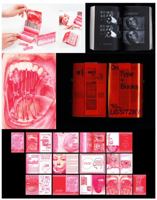
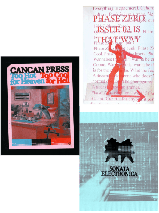
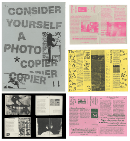
The magic of self-publishing and lo-fi production comes alive in Eloise Aitken’s printed matter
The article about Eloise Aitken mainly focuses on self publishing, lo-fi print production and physical editorial design. A lot of the work shown throughout the article uses collage, Xerox printing, scanning, Risograph printing and handmade editing techniques. The article is mostly aimed at graphic designers, editorial designers and people interested in print media but I think it would also be useful for students because it talks a lot about process and experimentation instead of only showing finished outcomes.
One thing the article focused on a lot was imperfection and physical texture. Eloise explained that she is inspired by radical print design from the 70s after the introduction of the Xerox printer as well as things like protest banners, magazines and zines. A lot of her work uses grainy textures, visible dust, low-resolution scans and rough collage techniques. I found that interesting because most modern design online is very polished and clean while her work almost does the opposite and makes imperfections part of the final outcome.
I also noticed a lot of collage work throughout the article which I liked because I already enjoy making grunge and punk visuals myself. The rough textures, layered images and imperfections reminded me of the kind of editing and experimentation I usually do in my own work. A lot of the publications felt handmade instead of overly polished, which made the work feel more human. I believe that balance between disorder and control is part of what makes the work interesting.
The article also explained that her work isn’t just about aesthetics. Eloise talked about being interested in the social side of Xerox printing and how it allowed people to make and distribute physical work cheaply and quickly. I think that changed the way I looked at the work because at first it just looked experimental and handmade, but the article made it clear there was more meaning behind why those methods were being used. The work feels less like commercial slop and more personal because of that.
A lot of the publications shown throughout the article are based on research, archives and collections of found material. The article mentions projects about cyberfeminism, Xerox art, radical publishing and independent cinema. Eloise explained that she enjoys bringing images and text together in unexpected ways through self publishing. I liked this part because the work felt very open and exploratory instead of following strict editorial rules. The publications looked more focused on communication and experimentation than trying to look perfect.
One thing I liked about the article was how physical everything felt. A lot of design now exists mostly online so seeing work focused on paper, printing, texture and handmade processes can be very refreshing especially now when you spend more time in comments trying to figure out if someones art is real or ai. The publications didn’t feel overly polished or corporate, which made them more interesting to look through. I also liked that the article focused on experimentation and process rather than trying to make the work seem perfect.
I think this article could influence my own work because a lot of the time I also experiment and layer random things together to see what happens. Seeing Eloise use collage, scanning and lo-fi printing made me think more about texture and imperfections instead of always trying to make things look completely clean. Even though a lot of my work is digital, I still think some of these methods and ideas could be useful when making layouts, posters or experimental visuals.
Language Of Design + Academic Study Skills
Language of design and academic study skills were my weakest projects. I was definitely not prepared for the transition from college to uni. The way we were given work and the expectations for the amount of work as well as the standard required were completely different from college. At college it felt more guided and broken down whereas at uni it feels like you are expected to manage everything yourself and figure things out with less structure. That made it quite difficult at the start because I wasn’t used to working in that way. I was also not used to having to deal with more than one project at the same time. At college most things were separated and you could focus on one main brief at a time but at uni everything overlaps and you have to plan your time properly or things will build up quickly. I struggled with that at first because I didn’t really have a way for managing my work or time so I ended up being behind and stressing myself out when multiple deadlines started to come together. I had to get used to having to explain my ideas in a more detail. One thing I was told was annotate your work like you are explaining it to a child despite some things being clearly in front of you. That way of thinking will guarantee you don’t miss anything. I am still getting used to doing that because I feel like there are some things that are genuinely just self explanatory. I don’t think there were many strength that came from those first projects. I do think there was still value in the experience even if it didn’t feel like it at the time. One of the main things I took from it was kind of a wake up call. It made me realise that you can’t really approach projects in the same way as college. I had to start focusing on how I could manage my time as well as start getting used to the idea of working on multiple projects at once. Besides some what struggling with the transition, It helped me realise what I need to improve. It was more of a readjustment point than anything and I’m still working on improving. Especially not leaving things last minute.
UX/UI + Contextual Studies
UX/UI and Contextual Studies was rough too. I still had the same habit of leaving things until the last minute and it kind of built up into me rushing a lot of the work before deadline so a lot of what I produced didn’t feel as considered as it could have been. It ended up being more about finishing on time rather than properly refining design choices. One of my biggest weaknesses was that I wasn’t explaining my decisions clearly enough. I would make design choices but I wouldn’t always go into enough detail about why I made them, how I made them or what went wrong during the process. Looking back, that made my work feel a bit incomplete because the thinking behind it wasn’t always visible. I also struggled with reflecting properly on issues, like why something failed or didn’t work as expected which is something I definitely needed to improve for future projects. Another issue I had was getting distracted quite easily and losing motivation quickly. I think that was partly because of to personal things going on at the time but it still affected how consistent I was with my workload. Some days I would be productive but then I would lose momentum and fall behind again which just added more pressure near deadlines. It created this cycle where I was always trying to catch up rather than stay ahead and develop work consistently over time. One thing I do think was a strength was my research. When I actually got into it properly I did become more interested in the project and it helped me figure out direction a lot easier. It also made it easier to build ideas and push parts of the work further when I had solid references to work from. I think the issue is I don’t always carry that same focus through the rest of the process. I’m not fully sure if I’m being too hard on myself but I still find it easier to point out what I did wrong than to properly recognise strengths.
Communication Design
Communication Design had many more strengths than the last project. I haven’t seen my grades or feedback yet so I’m not sure but I think I did well overall. I managed my time a lot better and I think that pushed the quality of my work. Having group crits really helped reflect on what I was making and improve things as I went along instead of leaving everything until the end. I was able to get a lot more done compared to previous projects and I wasn’t stressing last minute trying to finish work right before the deadline. I also feel like I documented my process a lot better this time. I made notes from feedback I received in the studio and explained what didn’t work and what I wanted to change moving forward. That helped me think more clearly about my decisions instead of just changing things without explaining why. I also kept designs that didn’t work unlike previous projects where if something wasn’t to my standard I would usually just delete it. Keeping failed ideas helped me reflect on the process more and showed how my work developed over time instead of only showing the final outcome. I think another strength was that I tried to experiment and adapt my ideas more than usual. Instead of sticking to approach early on, I tested different approaches and changed things when I felt the need. I believe that helped me become more open with the way I worked and stopped me from settling on the first idea too quickly. It also made the project feel more developed overall because I was willing to try different outcomes instead of just falling down one path through out. One weakness I still had though was not explaining my initial ideas as clearly as I could have. Sometimes I understood what I wanted to do in my head but didn’t really communicate it as well as i think i probably could’ve at the beginning of the project. I think that’s something I still need to improve because clearer explanations would make my process easier to follow from the start.
